A bad website design is the fastest way to close the door on new business.
97 percent of consumers read online reviews about a business before making a buying decision and there is no faster way to judge a business than by its website. Your website is your potential customer’s first impression of who you are and how you do business.
Did you know that 79% of people who don’t like what they find on one site will go back to the results page and and search again?
A bad website design is the fastest way to close the door on new business.
This post will explore the most common website design mistakes with examples of some of the worst websites we’ve ever seen.
Let’s take a look.
What does bad web design look like?
A bad website design might not always be filled with terrible fonts and blurry images. Some are simply impossible to navigate while others may contain pages of the same keywords repeated over and over again.
Here are the top 8 most common web design fails:
1. You didn’t have a plan when you built it

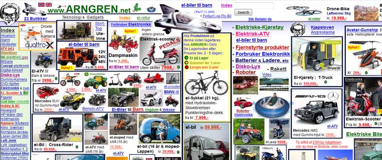
www.arngren.net
Building a website is exactly the same as building a business. From the first step of the process through to making your 1000th sale, your website needs to be planned out, executed and then re-evaluated continuously.
In fact, planning your content in advance is vital if you are to design a quality website that accurately reflects your brand and your business goals.
If your content is spread all over the place, like the example above, you won’t only fail to rank your site but you’ll also frustrate your customers so much they’ll actively avoid your business in the future.
2. You’re still using Flash

www.patimex.com (best enjoyed on their site with the sound turned on)
Flash is a relic of the bygone desktop computer-only era. Now that searches on mobile devices have surpassed the searches on computers, websites that don’t work for mobile suffer tremendously.
Here are some other reasons to avoid Flash:
- Flash content can’t be indexed, affecting ranking ability
- Flash is not supported on Apple devices
- It is a perfect host to malware, and
- Can’t be navigated on any touch screen device.
- Flash is no longer supported by any modern browsers
3. Your site loads slowly
The speed of online content delivery has not only increased our ability to learn but also destroyed our ability to wait. People now expect everything faster, and by fast, we don’t mean in under 10 seconds. Actually, 47% of people expect a web page to load in 2 seconds or less.
If your site is taking any longer than this to load, it’s time for a site audit.
4. Your site isn’t optimised
Your site may look visually perfect with great content and plenty of high resolution images. But, if your website isn’t telling Google or the other search engines what is on each page of your website, you won’t be able to rank.
SEO is no longer something to consider. With 3.5 billion searches on Google per day, you need to be taking steps to be visible.
5. Your site is too hard to navigate

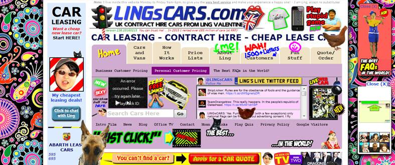
www.lingscars.com – for a laugh, look at the source code (click ctrl U when on the site)
Having a nonsensical and messy website is like inviting someone to visit your home then telling them to walk around the neighbourhood, behind your house, jump over the fence at the back and climb through your neighbour’s side window.
Your website needs to be organised.
From the menu at the top to the dropdown options and page layout, every element must be in its most logical place. Guide your visitors through your content to the point of making a sale. This funneling process should be seamless.
6. Your site isn’t mobile friendly
On April 21st 2017, Google altered its search algorithm to value mobile friendly websites more highly than desktop only. This means that if your site is not optimised for mobile, sooner or later it will get lost somewhere in the thousands of results pages, leaving you to fight to recover your rankings.

7. Your site is all about you
While your website is the best platform to showcase what makes your business unique, and why customers should buy from you rather than your competition, no one likes a bragger.
Your website should not be all about what YOU do, what YOU sell, how much experience YOU have. If anything, your website should focus on making your customer the hero at the centre of a story where you simply supply the support they need to solve whatever problem brought them to you.
Your website is an opportunity for your business to add value to the lives of your customers. Whether it’s an ebook about the best way to use photoshop, your ongoing blog series about SEO techniques or access to exclusive technical support, your business must be able to offer additional value beyond a single sale.
Build your customer’s trust and you will see them return again and again, establishing your brand as the authority in your niche and ensuring sales for years to come.
8. Your website looks like a Word document

While the old adage ‘content is king’ is true, if your site is purely pages and pages of text, you won’t keep visitors engaged. The key to good web design is striking the delicate balance between the visual and written elements of your site. Only show as much as you have to and only say as much as is needed for your customer to make up their mind about you.
Consultation with a web designer who understands content or can connect you with a content writer can help you to create a website that not only ranks well, is visually appealing but is also engaging to interact with.
Final thoughts
These website fails should give you some clear ideas about what not to do with your website. However, if you are still unclear about how your website should look, feel free to contact us.
