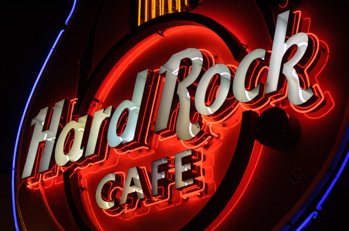
Your website logo is not a big neon sign!
Your website is supposed to create a visual link between potential customers and your brand, your products and services. So your logo design should be eye-catching, engaging and unique. It should leave an impression. However, when it comes to size, your logo probably doesn’t need to be as big as you think. In fact, it shouldn’t be.
The reason most business owners want a bigger logo is to help people remember their brand and to ensure they know whose website they are browsing. But having a logo as the most prominent part of your website is actually creating a negative image of your business. It can even have a negative impact on potential sales.
Your website logo doesn’t have the same job as a roadside sign that is designed to attract attention, like the Hard Rock Cafe neon sign in the image above. In fact, if you check the Hard Rock website, their logo isn’t big at all. If someone is viewing your website, you already have their attention! Massive logos that take up half of a user’s screen aren’t just irritating, they take away focus from the most important thing of all… how you can help them. If your logo is too overwhelming, potential users are less likely to scroll or browse through your website and read about what amazing things you actually have to offer. And that isn’t what you want!
The main purpose of your website should be to attract potential customers, providing them with information and helping them make an educated decision on whether you have something valuable that they need or want. So how big, then, should your logo be? Here are a few guidelines to avoid your logo simply being a waste of valuable selling space.
Logo Placement
Most logos appear along the top of a website as part of the header, ideally in the upper, left-hand corner as this is where most people automatically start reading. This is the main reason that your logo doesn’t have to be huge. However, depending on the proportions of your logo, it shouldn’t take up more than a quarter of the width of the screen – at most.
Because your logo will appear on every single page a user visits, they will soon recognize your company’s name and branding. The rest of the screen width can be used to convey other important information such as links to your website navigation, social media sites, a phone number or address, a call-to-action button or a current promotion you are running.
Logo Proportions & Dimensions
The ideal height of your logo should probably be no more than 75 pixels if you wish to maintain a fixed navigation bar. Having a small header and logo will also enable you to make the header permanent that won’t disappear when the user scrolls down to read, without giving up important content space.
For some logos that are square or round, a small header logo may be impractical. At that size, it may be far too small for the design of the page, or the logo text could be too small to read. If this is the case, I suggest that you create another horizontal version of your logo that allows you to use it effectively in different placements. The Noel Leeming logos below are examples of this.


Logo Text
If your company name is extremely long, I recommend that you use a brand name, acronym or visual representation rather than the full name. That way your users can still create the visual link to your business without you having to relinquish space and user-friendliness.
A logo does not have to include the company name and shouldn’t include the Limited Liability (Ltd) status of your company. This is old-fashioned and unnecessary. The last thing you need is a logo with text long enough to be a sentence on its own. Your potential customers do not need to know your company’s legal name, just your brand. For instance, our brand is “Energise Web” but our company name is “Energise Web Design Limited”.
Favicons
In addition to having your logo in the header, you can have your website represented with a tiny graphic, called a favicon. A favicon is a small icon that appears on the left of a website’s address bar. Favicons are a great way to having your logo present on the screen at all times without it being too overpowering. If your logo doesn’t suit a favicon, you can always use a different icon to represent your business or industry.
Logos in your website footer
To help build brand consistency, you can further add your logo at the bottom section of each page. Footers are often a lot larger than the header, so if you want a big logo, this is the place to put it. The footer area can be expanded to allow a large round or square logo without the same concerns as we have for the header.
Logos on Social Media
Every social media platform has its own guidelines for logos. You will need to adjust your logo for each platform you are using and be prepared to update in the future as their platforms change.
Do you need to update your logo?
Styles do change over time. Think about all the different versions of their logo that Apple has used since their early days. If you’re not entirely happy with your logo, get in touch with us for a free chat about your options!
