
How blue is the sky? How red is a rose? How green is the grass? The answer to each of these questions is anything but simple because colours change the way we perceive colours. For example, the colour of the clouds can seemingly change the blue of the sky. Just as well, the red of the rose and the green of the grass are influenced by their surroundings in terms of hue, saturation or brightness.
What may sound confusing is indeed a simple physical phenomenon called simultaneous contrast. How we perceive colour is highly dependent on its relationship to other colours within our field of vision. While the actual colours do not change, we do see them in a different light depending on how they interact with neighbouring colours. French chemist Michel Eugène Chevreul first explained this occurrence in 1839 by stating that if two colours are placed next to each other, each will take on the hue to complement the adjacent colour.
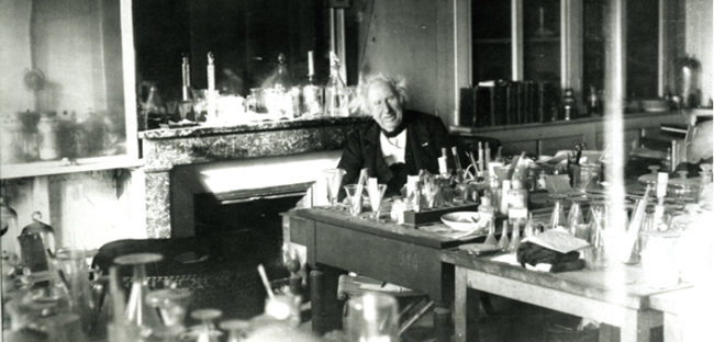
Michel Eugène Chevreul
Complementary colours
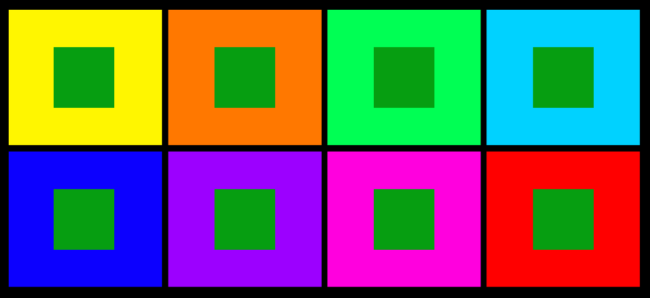
Simultaneous contrast is most intense when complementary colours are placed next to each other. On the basic colour wheel, any hues directly opposite each other are called complementary colours. By mixing any two colours, shades or tones, an unlimited number of complementary colour combinations can be achieved which in turn form a special relationship. Placed next to each other, one enhances the other, making it look more vibrant.
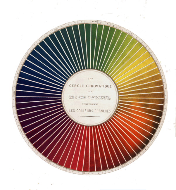
Colour wheel, any hues directly opposite each other are called complementary colours.
One of the most famous users of simultaneous contrast was Dutch artist Vincent van Gogh. Placing complementary colours side by side, he managed to convey extremely strong emotions in his paintings such as “Night Café in Arles” (1888). The constant clash of colours creates feelings of discomfort in most viewers, along with chaos and a powerful unsettling intensity.
pic of van Gogh and the painting referred to
Simultaneous contrast in web design
Talking about simultaneous contrast is a bit like talking about water temperature. Place one hand in a bucket with ice-cold water and it will feel ice cold. Place the other hand in a bucket of hot water and you will feel the heat. Now put both hands into a bucket with half cold and half hot water. The hand from the cold bucket will suddenly feel warmer, while the hand from the hot bucket will experience coldness.
So, what does this have to do with web design? Just as our perception of the water temperature is influenced by the previous temperature, adjacent colours influence each other and our perception in regard to hue, saturation and luminosity. If you want to lighten up a colour, surround it with a dark border and vice versa. However, a dark surround also seems to lessen the contrast of colours within the border, so they in turn will need to be intensified.
Just as well, warmer colours will seem even warmer when they are placed next to cool ones. This in turn will make the cooler colours seem even cooler, enhancing the contrast. In web design, contrast is highly important to draw users’ attention to key elements on a website. It also enhances readability, which is why finding the right balance between background colour and web content colour is essential.
There is also a direct link between colours and emotions. Understanding the relationships of colours and their effect on people’s perception will enable you to design a website that creates the right mood and atmosphere for your users depending on your industry and the message you are trying to bring across.
For a website that is right for you and your business, talk to the friendly team at Energise Web today.
Need Website Help?