
 There is nothing more frustrating than opening a website on your smartphone, only to realize that bits are missing, images distorted or scrolling in every direction to navigate through the pages. Back in the days before smartphones took over as the preferred way of surfing the internet, web designers only needed to worry about making a website look nice and user-friendly on desktop computers.
With the addition of new devices including smartphones, tablets, chromebooks and more, a static web design can easily ruin users’ experiences who prefer a range of channels to access the net. After all, mobile devices now make up more than 54% of all website traffic while the usage of desktop computers has dropped to under 43%.
What is responsive web design?
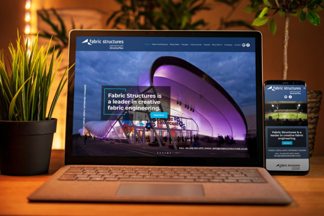
A responsive website design automatically adjusts the website to fit any screen or device by hiding bits that are less important, shrinking, enlarging or scaling text and images and resizing the layout to create the best possible user experience, no matter if a user is surfing on a computer, tablet or phone.
It also enables web designers to change the position and appearance of menus, drop-down buttons and online forms to ensure they don’t disturb the user’s experience, ensure that they are seen or interfere with readability. For example, a 3-column website layout may look fantastic on a wide computer screen but will be very hard to read on a mobile device with a much smaller screen size.
Responsive vs. adaptive web design
The idea behind both approaches is exactly the same, yet the way they are executed differs hugely. A responsive web design displays one website in different ways regardless of the device being used. The layout is adjusted according to the screen size.
In contrast, an adaptive web design generates different templates which are unique to each device. When a user visits a website, a script in the background checks for the screen size being used and accesses the template which was designed for that particular device. Adaptive designs tend to be more expensive to build and maintain and are more likely to “break” as devices change and are introduced.
Best practice
When planning for a responsive web design, there are a few points to consider in order to maximise its potential. Your website designer or developer can talk you through the process and ensure your website meets your needs and those of your audience.
Landing pages
A mobile-friendly landing page is one of the most important things to consider when creating a new website and easily done using a responsive web design. After all, the majority of search engine queries are now conducted on smartphones, meaning most of your website visitors will be on a mobile device.
If you are presenting more than half your audience with a landing page that is not designed for them but instead is hard to read and hard to navigate, they will most likely end up looking elsewhere to find what they need. Bad conversion rates mean fewer leads and you end up spending a lot of advertising money for nothing. You can check the mobile-friendliness of your website with a free Google test.
Speed
A responsive web design can have an impact on the loading speed of your website which should be a top priority. Pages that take more than 5 seconds to load already have a bounce rate of 38%, so the approach you take to making your web design responsive should not block or delay the loading process any more than it needs to.
Responsive text
When talking about a responsive web design, people often think about images, video and navigation issues that can interfere with readability and user-friendliness. However, in order for your layout to be truly responsive, text blocks should also be taken into consideration and font sizes adjusted to match a variety of screens and devices.
Click to call links
When a viewer is using your website, they may want to contact you right away. Ensure that all your phone numbers include a click to call link. This allows a smartphone user to phone you directly from your website without copying and pasting your phone number into their phone app. Don’t forget the phone numbers in your footer. You may even want to include a click to call button that only displays on smartphone screens.
Email options
Like the click to call links, all email addresses should link to an email app. Note that not everyone has email links enabled on their browsers, so it’s best practice to display the email address in case they do need to copy it. If you’re worried about email spam and don’t want to have email links on your website, use a contact form that requires a Google captcha to remove automated enquiries.
A responsive web design has become an absolute must if you want to stand out from the crowd, keep up with the competition and ensure that all of your audience clearly gets the message you want to bring across with your website. Ultimately, a responsive web design will highly improve user experience which in turn generally leads to higher conversions and business growth.
For more information on how to create and design a website that is right for you and your business, talk to the friendly team at Energise Web today.